First 1.5 months at Datadog

1.5 months have passed since I started my first FT job at Datadog as a product designer. I figured it was time to organize everything I had learned thus far.
Turns out, there’s a lot of learning. Like, a lot. I’ve broken them down into categories:
- Career
- Design philosophy
- Design iteration
- Critique
- Research
- Cross-functional collaboration
- In person vs remote
- Other
These learnings come from coffee chats with designers, workshops, and design reviews.
Career
I own my career.
This came up during one of my 1:1s with one of my mentors. The specifics of the conversation were a blur, but what I remembered was:
You have to own your career. Your manager is there to help you, but you should lead these conversations. If you’re not proactive and intentional about your career, nobody else will. So take the initiative.
Once I started work, it was no longer the same 3 month period as an internship. I’m playing the long game now. I need to take responsibility for where I want to go and how to get there.
Design philosophy
Have an opinion
Honestly, I’m still grappling with the exact definition of this. This is more of a note for myself to have a voice and know what I like and don’t as a designer.
I’ll go over this more in-depth in a later section about design review.
Speak up
This is my weakness. What happens when you combine introversion and risk aversion? Me. Someone who finds speaking up daunting.
Deb Liu (Ex. VP at Facebook) shared what her team member once said:
I am a processor. By the time I figure out what to say, the conversation has already moved on.
This hits hard.
During our first few design reviews, I did not speak once. And I felt bad. Looking back, it was completely normal for me to not know what to say without any context or domain expertise. But, I wanted to do something about it.
So, I started small. I brought my notebook to design reviews. The act of taking notes helped me process the constant streams of information. Knowing what to say gave me the confidence to speak up.
I also started to set the following goals:
- Speak up one or two times per meeting
- Respond to a relevant design doc at least once per week
I didn’t hit these goals every time. But I’m trying and putting myself out there. Because if I don’t speak up, no one will know what I think or what I’m doing.
Be objective
This stemmed from a coffee chat with a staff designer at Datadog. Great designers are objective. They don’t get carried away by emotions. Instead, they focus on the concrete: pros and cons of designs, alternatives if this doesn’t work, helpful actions, etc.
To give a rough example, in one of the staff designer’s early project meetings, the conversation got so heated that she had to step in and say:
Hey this meeting isn’t productive anymore. I’ll type up the key points in today’s meeting, share them in our team channel, and let’s re-group sometime later this week to discuss again.
Instead of getting carried away, she focused on what could keep the project going and took the initiative.
MVE
MVE stands for “Minimum Valuable Experience.” My skip manager introduced me to this concept. It’s a different viewpoint from the ubiquitous MVP, which stands for “Minimal Viable Product.”
There are two key components in MVE:
- Valuable: The design focuses on the value delivered. This requires a thorough understanding of a user’s goals and problems.
- Experience: Instead of thinking about a singular product/feature, think about the holistic end-to-end experience. Where was the user before this page? Why did the user come to this page? What does the user do on this page? Where does the user go after this page? It’s about the experience, not the product.
Design iteration
Don’t pre-filter my designs
When designing options, don’t assume engineering capacity and pre-filter my designs. In simple terms, don’t eliminate designs that I think are hard to build.
I made this mistake on my first design project. I wanted to ship something. I wanted to deliver impact fast. So, when proposing my designs, I focused on the bare minimum design. A design that was the easiest to build.
This can definitely be built. I don’t want to burden the engineers as a new-grad designer. I think I’m done with designing. Right?
But deep down, I felt like there was something wrong. I just couldn’t articulate it. Until I chatted with my manager one day, and he said:
Don’t pre-filter your designs by the level of “easy-ness” to build. Your job is to explore different concepts that each tackle the problem a little differently. Out of these options, you will then recommend an option that tackles the problem the best.
In terms of feasibility, you can discuss that with your engineers / PM afterward. If they really can’t build the “north-star” designs, you can suggest breaking it down into actionable chunks of implementation. But don’t start from that!
Have an opinion on my design concepts
This also happened during my first design project. In the beginning, I would just show my PM different options and let him decide. However, after chatting with my manager, I realized this wasn’t the way.
We as designers have voices. And it’s our job to recommend designs with rationale, not just be a design-generating machine.
Design critique
Presenting designs & receiving feedback
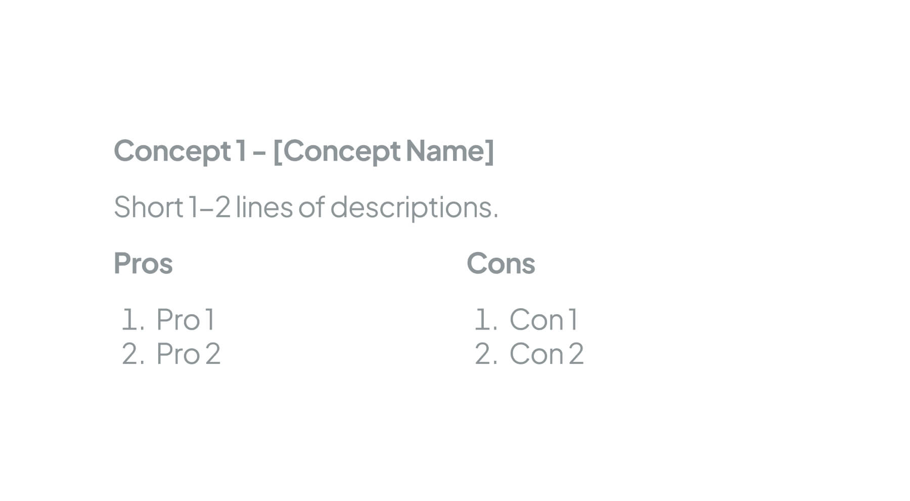
This is a continuation of the previous section. One addition to your “north-star” designs or recommendations is the pros and cons. Below is an example from one of the Sr. Product Designers on my team.

On a broader level, receiving feedback is a whole art form. Here were some tips my skip manager shared during her feedback workshop:
- It’s not a one-person game: “I haven’t thought about that idea actually. John, do you want to jam on this sometime tomorrow so we can flesh this out?”
- Delaying feedback is okay: “Hey that’s a great question. I don’t have a response right now. Can I get back to you with a clear answer later on Slack?”
Giving feedback
Criticism passes judgment. Critique poses questions.
This was from my skip manager’s feedback workshop a few weeks ago. During a critique, often the best way to give feedback is to ask questions.
In the workshop, she highlighted three principles:
- Be specific: Focus on detailed aspects of what works and what doesn’t. And explain why with clear reasoning
- Stay objective: Relate feedback to customer & business goals
- Be honest: Share candid feedback (you don’t have to “sandwich” feedback) but make sure it’s thoughtful and builds trust with the team
In terms of tips/techniques, she also walked over these:
- Frame suggestions as opportunities: “Have you considered simplifying this step?”
- Recognize good design: “I love how you’ve organized the content.”
- Understand the designer’s intentions and user’s perspective: “I understand you [made this design decision], but I’m concerned this element might confuse first-time users.”
User Research
Research is about risk management
This is a helpful framework for choosing whether to chat with internal or external users.
If a project is risky and has a large potential impact, then we want to chat with the right users (aka external users). If the project is more low-stakes and smaller impact, then we can quickly get validations from internal users.
It’s about managing risk and building confidence towards a decision.
Focus on real-life experiences as much as possible
What people want/think can be drastically different from what they do. So ask about their real-life experiences/most recent uses. For example, instead of asking
When do you open the application?
Ask:
Tell me about the last time you opened the application. What happened?
Cross-functional collaboration
One of the most underrated skills as a designer is people skills. How to work well with cross-functional partners (engineers, PM, etc); How to stand up for your designs & even push back; How to build a positive feedback loop in your team; How to rally your team and get them excited about a direction: There is so much more to a designer’s role than pixel-pushing.
Ask clarifying questions
It’s inevitable that at one point, you will be pushed back for your design proposals. What matters is how you respond.
From what I learned so far, the best approach is to ask clarifying questions. Let’s walk through a couple of hypothetical scenarios.
Engineer: This will take longer to build…
Design: How much time will it take? How urgent is this project?
Engineer: This won’t work… // This doesn’t work.
Design: Why wouldn’t/doesn’t it work?
Engineer: This seems too complex/expensive to implement
Design: Can you help me understand which parts are causing the most complexity? Is there a simpler way we could achieve a similar experience? OR What if we try [a simpler version]
PM/Engineer: We don’t have time for this right now.
Design: What are the key priorities at the moment? (Internally - decide if this is a battle you want to fight for. If yes, then ask the following) Is there a way to break this design into phases so we can tackle it incrementally?
Meet them where they are
For designers, engineers are expected to go into Figma and comment. Why don’t we do the same?
Create a GitHub account. Ask your engineers to join their team. Learn what a PR (pull request) is and try doing it once for your next project.
In person vs remote
Datadog requires employees to go into the office three times a week. I love the office, so oftentimes it’s a no-brainer. I would sometimes go 4-5 times per week for the food, incredible view, and latte art practice.
But, there were certain days when I wanted to stay home. Or even sometimes, arrive at the office at 9 AM, do some work, and go back home after lunch.
At first, I felt bad about this. Shouldn’t I go to the office or stay for the full day every day to socialize with people?
Slowly I realized: The best parts about going to the office are the perks and chances to socialize. But, the potential downside is that it’s extremely difficult to get solid focus work in. I cannot recall how many times I wanted to deep work, but just couldn’t because of all the fun conversations near me.
So, I started to balance it out. I accepted that it’s completely okay to want to deep work at home. I still go to the office at least 3 times a week, but I don’t force myself to stay or go if I don’t feel like it.
Interesting read
Introducing Revolution by Emily Freeman
A call to change the dinosaur software development lifecycle and embrace the chaos. I also find her proposal of roles over personas fascinating. Persona oversimplifies someone’s career or needlessly complicates it. Roles are different - They’re not tied to a specific job title. Roles are fluid, temporary, and inconsistent.
Low fidelity design is higher up the value chain
Very refreshing perspective pushing for lo-fidelity designs. Some of my highlights:
Design is a machine for destroying ambiguity. Creating a common visual that everyone could look at instantly made it clear that the inputs were insufficient, and gave me the opportunity to frame the missing pieces.
The biggest value of design is not delivering a thing faster. It’s delivering the right thing faster.
Lo-fi design is a tool for conceptual definition.
Newsletter
I share new posts, designs, and cool inspirations.