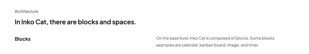
How I built my new portfolio

Why a new portfolio?
Creating a new portfolio every year has been a tradition for me. Here are the main reasons:
1. To test my skills
I felt like this portfolio was the ultimate test of my design & dev skills up to this point. I wanted to design a portfolio I’m truly proud of. I also wanted to code it from scratch, which is something I’ve never done before. From the start, I knew I’d learn so much from this redesign.
2. Update my projects
I wanted to showcase all my proudest works. I felt like it was a bit limiting to showcase only one project from each company. At first, I was a bit hesitant because it’s different from how normal portfolio display their work. But, after asking a mentor and seeing other successful examples, I decided to go for it.
Guidelines for myself
Before I began, I set a few guidelines for myself.
1. Code from scratch
In the past, I’ve coded small sites such as an anime site and resource gallery. But, I have never coded my portfolio before. So, this was the most challenging part for me as a designer. Here is the GitHub repo.
2. Don’t be afraid to be myself
I wanted this portfolio to “feel” like me. The illustrations. The vibe. The colors. The details. I want to sprinkle in different glimpses of me: Who I am, what I love, and what I care about.
3. Focus on accessibility
This is a shoutout to my mentor: Mike Mai. He was my mentor when I was at Pega, and he introduced me to the world of accessibility. Honestly, my new portfolio isn’t my proudest work on accessibility. I felt like there’s still a lot I missed/forgot, but I guess the point here is to learn by doing.
4. Focus on craft
It’s hard to define what craft means. I think it comes down to a mix of attention to detail, intentional decisions, aesthetics, care, refinement, etc.
Inspirations
Isometric art
There’s just something special about isometric art. Maybe it’s the sense of order. Balance. Straight lines.
Clean, light interfaces
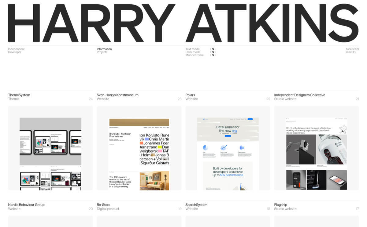
I was greatly inspired by minimal interfaces and designs. Some examples are Rachel, Emil, Gavin, Anton, Alim, typo, Attio, Family, etc. I gasped when I saw Harry Atkin’s website.
Design iterations
I won’t go over each of them, but here is a gallery of the different iterations I went over.

Final design + considerations
Home page
Hero illustration + interactions
The isometric grid and objects are not 3D. I drew all of them in Affinity Designer.

At first, I tried to draw them in Figma. But discovering Affinity Designer’s isometric view, I never looked back. It was super fun to think of different personal objects and draw them out.
After I drew the objects and grid lines in Affinity Designer, I copied and pasted them in Figma to set up the scene. This was because I wanted to include the “id” attribute when exporting SVG from Figma. This helped a lot when organizing my SVG later in code.
The hover interaction on the isometric objects was inspired by Shape, a workout calendar built by Samuel. When you hover over the text “modern and fast,” you’ll know what I mean.
Project gallery
The purpose of this section is to showcase many UI shots for each project. I took inspiration from Alim, Dimitri, Joseph, and Marco.
About image hover, I really like Perry’s project hover. So I created something a bit similar.
Lastly, I saw Mitchell Clement’s LinkedIn post titled “Most Case Study Titles are Boring.” I really liked his advice on showing the scope of work or leading with the outcome in titles. So, I changed all my titles.
Case study
I won’t go into each specific case study, so I’ll point out some of the details.
Two column layout
This was largely inspired by Perry, Joseph, and Natalie’s portfolio. The two-column layout prevents my paragraph from stretching too long.
Screen recordings
I used Screen Studio for the UI recordings. One of the best investments I’ve made (also got a student discount). The hardest part was definitely planning the recording sequence.
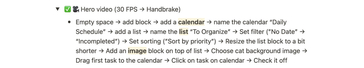
Image caption
I’ve been dying to use Commit Mono somewhere in my portfolio. It’s such a beautiful mono font. I figured the image caption would be a good place to use it, and I’m glad I did.
Laying out the structure and prepping images
For each of my case studies, I would write a Notion doc writing down the entire structure and images needed. It did get draining often, but I found this practice to be extremely helpful when implemented.

In terms of the image assets, I designed them all in Figma. Then, I exported each of them 1.5x or 2x for a better image quality. I would export PNG for transparent background and JPG otherwise. Lastly, I would compress all of them using TinyPNG.
For Inko Cat alone, I created 30 different image assets.

About page
The interesting part about the About page was that I didn’t have a concrete design before implementing it.
So, I’ll delve more into this page later.
Development + considerations
With most of the designs completed, I dived into the code.
How I built it
HTML, CSS, JavaScript (JS), and Astro — This was my tech stack.
I wanted to familiarize myself with the basics and not get too fancy (Next JS has some serious clout/rizz). About Astro, I simply wanted to try it out. And looking back, I don’t think I used even 10% of its full capability.
Helpful resources
Along the way, I read and watched a lot of resources. Here are the ones that I found useful:
Details
Next, I want to delve into specific implementation details. Below are the ones I feel are worth highlighting:
Hover tooltip
To achieve this effect, I used a mix of data-tooltip-content and JS.
<g id="ping-pong" data-tooltip-content='<div class="tooltip-content"><figure class="tooltip-fig"><div class="skeleton"></div><video class="tooltip-icon" muted autoplay loop src="../images/hero/[table-tennis-720s.mp](http://table-tennis-720s.mp/)4"></video></figure><p class="tooltip-text">I used to play table tennis competitively (8 years)!</p></div>'
</g>
The data-tooltip-content was relatively straightforward. But now, the question was:
How do I display these when I hover over the objects?
At the time, I legit did not know how to do this. So, I went to Claude AI and asked how to do it.
After several back and forths and me trying to understand the code, it came up with the JS code to make it work:
const svgItems = document.querySelectorAll('#spaceship, #laptop, #ping-pong, #microphone, #cup, #pencil, #cat, #pencil, #art-palette, #taipei-101, #totoro, #pen-tool');
const tooltip = document.createElement('div');

tooltip.classList.add('tooltip');

svgItems.forEach(item => {
  item.addEventListener('mouseenter', (e) => {
    const tooltipContent = e.target.dataset.tooltipContent;
    tooltip.innerHTML = tooltipContent;
    document.body.appendChild(tooltip);

    const rect = item.getBoundingClientRect();
    const x = rect.left + rect.width / 2 - tooltip.offsetWidth / 2;
    const y = rect.top - tooltip.offsetHeight - parseFloat(getComputedStyle(tooltip).fontSize) * 1.5;


    tooltip.style.left = `${x}px`;
    tooltip.style.top = `${y}px`;
    tooltip.style.position = 'fixed';
    tooltip.classList.add('show');

  });

  item.addEventListener('mouseleave', () => {
    tooltip.classList.remove('show');
    tooltip.remove();

  });
});
Without Claude, I would have never come up with this from scratch.
Page transitions & load
I used keyframes and animation-delay to create smooth page transitions. I wanted the nav bar to always be present, so I set the code as follows:
body > *:not(nav) {
    animation: fadeIn 0.75s ease-in;
}
Then, for the isometric illustrations, I added animation-delay to all of them. This ensures that all the moving illustrations will only start after the page loads. This prevented any weird jitters or flashes.
@keyframes spaceship {
    0% {
        transform: translateY(0);
    }
    50% {
        transform: translateY(-10px);
    }
    100% {
        transform: translateY(0);
    }
}

#spaceship {
    animation-name: spaceship;
    animation-duration: 3s;
    animation-iteration-count: infinite;
    animation-delay: 1.5s;
}
Also, a super small detail I implemented was the skeleton image for the tooltip image. This prevented the tooltip from changing its height when loading the image/video.
Here is what it looks like if my portfolio loads on fast 3G wifi:
<figure class="tooltip-fig"><div class="skeleton"></div><video class="tooltip-icon" muted autoplay loop src="../images/hero/table-tennis-720s.mp4"></video></figure>
You can see in the code that I added a div with the class of skeleton. I then assigned it a fixed height and a z-index of -1.
.skeleton {
    position: absolute;
    background-color: var(--color-background-secondary);
    width: 100%;
    height: 160px;
    top: 0;
    left: 0;
    z-index: -1;
    border-radius: var(--border-radius-small);
    animation: loading-skeleton 1s linear 3 alternate;
}

@keyframes loading-skeleton {
  0% {
    background-color: var(--color-background-secondary);
  }
  100% {
    background-color: var(--color-background-tertiary);
  }
}
Also, I pre-loaded all the fonts to prevent FOUT (Flash of Unstyled Text). What happened was, that when I pressed on the navigation, the text flashed once on a new page. The flash is the split second when the system font switches to the intended typeface.
<link rel="preload" as="font" href="/fonts/PlusJakartaSans-Regular.ttf" type="font/ttf" crossorigin>
    <link rel="preload" as="font" href="/fonts/PlusJakartaSans-Medium.ttf" type="font/ttf" crossorigin>
    <link rel="preload" as="font" href="/fonts/PlusJakartaSans-Bold.ttf" type="font/ttf" crossorigin>
    <link rel="preload" as="font" href="/fonts/PlusJakartaSans-SemiBold.ttf" type="font/ttf" crossorigin>
Lastly, I wanted to ensure my portfolio runs relatively fast. So, I did the following:
- Optimize images by ensuring all of them are at least under 200KB.
- Added
lazy-loading(video) on all images
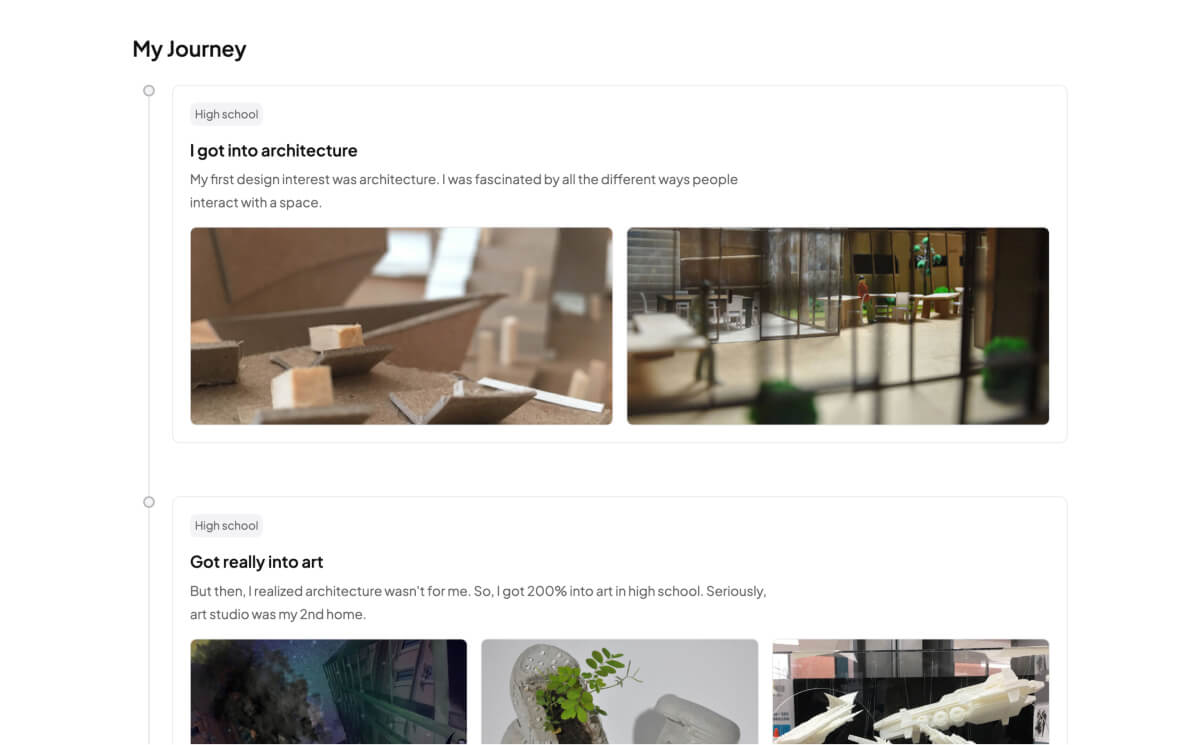
About page - timeline
I created the timeline by following this written tutorial. At first, I thought of doing a zig-zag format. But I changed the timeline to left aligned because zig-zag left too much white space on either side.
About page - “What I love”
My initial design was a simple image gallery. But, when implementing, I asked myself:
Why not add a hover caption?
That thought led to the current version. When you hover, you can see more information about the image. Implementing this was one of my favorite parts of the process.
Accessibility
There were also accessibility considerations for my new portfolio.
- Color contrast: WCAG 2.1 Level AA. 4.5:1 for text elements and 3:1 for non-text elements.
- Responsive and fit within a 320px viewport without any loss of content and functionality
- Semantic headings (h1 to h6)
- Alt text for all informative images
- Use of landmarks
- Links are only used to navigate
Skip to main content
I added a skip to main content button so that keyboard users can skip the navigation. I followed this article to implement it.
Card hover and navigation
The worst thing you can do for a block link is to wrap everything in the
<a href>.
As warned by Adrian Roselli, a well-known accessibility expert, in this article, I made sure to not make this mistake. This is because if you wrap the <a href> around the card, the screen reader will read the entire string in the card. This isn’t necessary since oftentimes you only need to know the header link.
So, what I did was I wrapped the <a href> with the card heading.
<h4>
  <a href="https://www.inko.cat/" target="_blank" class="title-a">Inko Cat</a>
</h4>
Then, I applied the following CSS. When the user tabs on each card, it focuses on the heading instead of the entire card. The only downside of this is that users cannot select the text on the card. In this case, that isn’t necessary so it’s fine.
.link-card a[href]::after {
    content: "";
    display: block;
    position: absolute;
    top: 0;
    bottom: 0;
    left: 0;
    right: 0;
    transition: all 0.3s ease;
}
Future
Last week, I posted my portfolio on Twitter (I don’t think I’ll ever call it X). And to my surprise, it got a lot of traction - 20K impressions. If you’ve been on Twitter long enough, you may think it’s not a lot. But to me, it’s a lot, and I appreciate everyone who took the time to view my portfolio and comment under the tweet.
With the portfolio in a good place, I want to write down some future initiatives.
Refresh on accessibility
Building this portfolio made me realize:
Man, I suck at accessibility.
Compared to when I was at Pega (3 years ago), I have forgotten a lot of the important accessibility concepts. So, I will retake the Web Accessibility (Google) course. This was the course my mentor Mike told me to take during my internship.
Accessibility shouldn’t be a checklist. It’s an empathetic way of designing and coding.
UI experiments
I’ve been following a lot of cool UI experiments. Here are some of my recent favorites:
- Emil Kowalski
- Craft (Rauno Freiberg)
- uilabs (Mariana Castilho)
- lab (Julien Thibeaut)
- Interaction Corner (Amelie Schlüter)
One related video that inspired me recently is “So You Think You Can Build A Dropdown?” by Pedro Duarte. Such a cool and informative talk. It opened my eyes to the complexity of building a seemingly simple component.
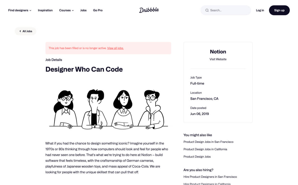
To put it short, I will become a “Designer Who Can Code”. In 2019, this was the title Notion used to hire (link). It’s too cool to have an idea and know how to make it come to life.
And to do that, I will continue to build. And build more. But also, I will be writing more because I believe - it’s important to stop and reflect sometimes.
Want to stay updated?
Subscribe to my newsletter to get the latest updates on new blog posts and cool design finds!